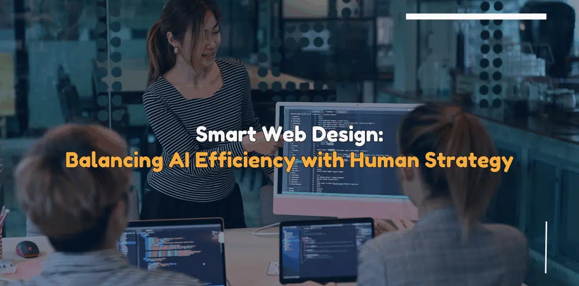
A Guide to Choosing the Right Color Palette and Fonts for Your Website in 2023
Choosing the right color palette and fonts for your brand or website is imperative to create a visually appealing and memorable identity. Aesthetics plays a crucial role in capturing the attention of your target audience in today’s digital world.
Every business tries to create a brand identity and set itself apart from the competition, and color palettes and fonts play a huge role in helping them achieve it. It may be hard for you to understand as a business person.
That’s why we are delving into the process of selecting the appropriate colors and fonts and helping you choose the same in this blog.
Importance of Choosing the Right Color for Your Brand/Website
Colors are important for a business or brand as they can communicate emotions, influence perceptions, and establish a strong connection with your audience.
Let’s explore why selecting the right color is important for your business:
- Colors help establish a unique brand identity by evoking specific emotions and conveying the desired personality. Choosing the right colors can align your brand’s visual representation with its core values.
- The right color scheme can make your brand and website more memorable. Colors differentiate your brand from competitors and leave a lasting impression on your audience.
- Colors have the power to evoke emotions and influence how your audience perceives your brand. You can communicate the intended emotions and strengthen your brand image by choosing colors to emote the audience.
How to Choose the Right Color for Your Website/Brand
Choosing a color combination for your brand and website is crucial, as your website and branding have huge roles to play in helping you grow. Therefore, associating it with colors must be done after thorough consideration.
Here are a few ways to choose a suitable color for your brand and website.
Establish your brand identity
Whether you aim to evoke trust, excitement, or serenity, the right colors can help you align your brand’s visual representation with its core values. Colors can convey a specific mood or personality, allowing you to effectively shape your brand’s identity.
The right color will help establish your brand identity and differentiate your business from the rest of the market.
Hence, think about what identity you want for your brand and pick a color accordingly.
Look for inspiration
Choosing the right color is a challenging process. Having worked with several clients with the same, we know that it is a tedious process.
The best way is to look for inspiration and what big brands have done. You can also explore various platforms, including websites, magazines, or even nature itself.
Observe color combinations that catch your eye and consider if they might fit into your brand or website’s overall aesthetic.
Choose your primary color
The best way to pick your brand colors is by selecting a primary color that embodies the essence of your brand. Based on your primary color, you can build your entire color palette.
While doing so, you must ensure that the chosen primary color aligns with your brand’s personality and differentiates you from competitors.
Once you have set the foundation, it would be easier for you to move forward and pick a few colors that match your primary color and brand identity.
Explore the meaning of the color
Each color holds inherent symbolism and cultural associations. For instance, red often signifies passion or urgency, while blue evokes a sense of calmness or professionalism.
Understanding the psychological impact of colors can assist you in choosing hues that align with your brand’s message and echo with your target audience.
Associating your brand with a color that oozes out value will help you place your brand effortlessly into the minds of your audience.
Choose the secondary colors
Secondary colors complement the primary color and add depth. They bring a unique sense of versatility to your overall design.
You may choose various techniques, such as using analogous, complementary, or triadic color schemes. Go ahead and experiment with different combinations.
This way, you will be able to find the perfect balance between primary and secondary colors that enhances your brand’s visual appeal.
Test your colors and finalize
Once you have established your primary and secondary colors, it is time to rest their compatibility. This is crucial to test their compatibility across different devices and mediums.
Keep in mind that colors can appear differently on various screens or in print, so conducting thorough testing ensures consistency and a seamless user experience.
After finalizing the overall tone and texture of the colors you have selected, you can go ahead and fix them as your brand colors.
Importance of Choosing Fonts for Your Brand/Website
Just like colors, fonts also play a crucial role in making your website unique and different from your competitors. Having a consistent font can help your business:
- Have a defined semantic feel
- Ensure a singular reading experience
- Distinct feel on multiple devices
How to Choose the Right Font for Your Brand/Website
While color attracts attention, typography is the vehicle that delivers your message effectively. Fonts are important to ensure better readability, legibility, and overall aesthetics of your brand or website.
Let’s explore how you can select the right font:
Find inspiration and study fonts
As with colors, gathering inspiration and studying different fonts is important. You can do this in many ways, such as exploring typography trends, checking successful brands, etc.
This will help you identify fonts that align with your brand’s image and values. If you can dedicate some time to do this, you will gradually understand its nuances.
And you can easily pick a font that suits your brand.
Choose fonts for legibility
Each character in your brand name must be easily distinguishable. This is referred to as legibility. Whether it is your name, slogan, etc., audiences must be able to read it.
When choosing fonts for your brand or website, prioritize legibility to ensure your audience can read your content effortlessly.
Avoid overly ornate or complex fonts that may hinder readability, especially in smaller font sizes or on different devices.
Compare typefaces side-by-side
Typography involves a myriad of choices, from serif to sans-serif, script to display fonts. Compare them side-by-side to evaluate their legibility and overall compatibility while choosing fonts.
Analyze the tone and message you want to convey through branding and ensure that the selected fonts effectively reflect what you want to communicate the way you want to.
Choose the proper font size
Another critical factor in delivering your message effectively is the size of the font. Strike a balance between readability and visual hierarchy. If you don’t pay attention to the font size, it can either become too large or too small, which are both problematic.
Ensure your font size is appropriate for different devices, accommodating various screen sizes without compromising legibility.
Mind line height and spacing
Line height, also known as leading, determines the space between lines of text. Adequate line height enhances readability, preventing text from appearing crowded or overwhelming.
Also, check the spacing between letters and words, ensuring they are visually pleasing and contribute to the overall clarity of your content.
Fine-tune fonts for readability
Readability is how easy it is to comprehend the blocks of text. If it is easy to read, it has a higher readability.
In our opinion and experience, it is the first element you must consider when choosing your typography. When picking typography, you must pay profound attention to factors such as letter spacing, line length, and paragraph spacing.
Aim for an optimal balance that facilitates smooth reading experiences and encourages engagement with your content.
Test readability and legibility
Before finalizing your font choices, conduct thorough tests to assess the readability and legibility of your content.
View your website or brand materials on different devices and evaluate how well the fonts perform across various platforms. Adjustments may be necessary to ensure a consistent and delightful reading experience for your audience.
Finalize the typography only after conducting enough testing and experiments.
Conclusion
Selecting the right color palette and fonts for your business or website is a meticulous process that requires careful consideration. By understanding the importance of color psychology and conducting thorough tests, you can create a visually captivating and cohesive brand identity.
However, working with an agency offering affordable web design in York is the best option if you want to do it professionally. Thanks to our impeccable team, Eco York has developed a strong reputation as a reliable website design agency in York. Our experience with some of the leading businesses and brands in the local and international markets makes us your ideal choice.
We create flawless designs that help our clients get more visitors as we focus on delivering better user experiences on the websites. We also offer custom website design services fitting the aesthetic and brand philosophies of the client. If you want to work with the best and get cost-effective web design, Eco York is your best option.
Contact us to find out how we can help your business grow.